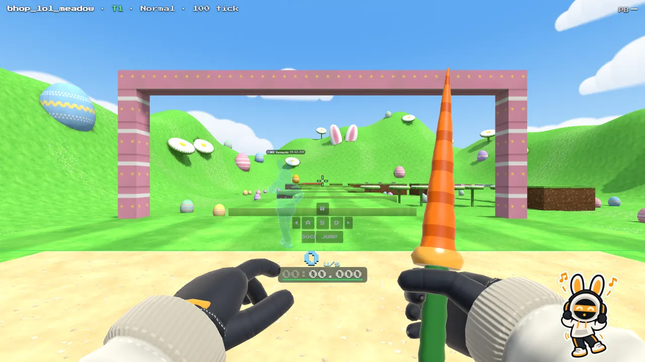
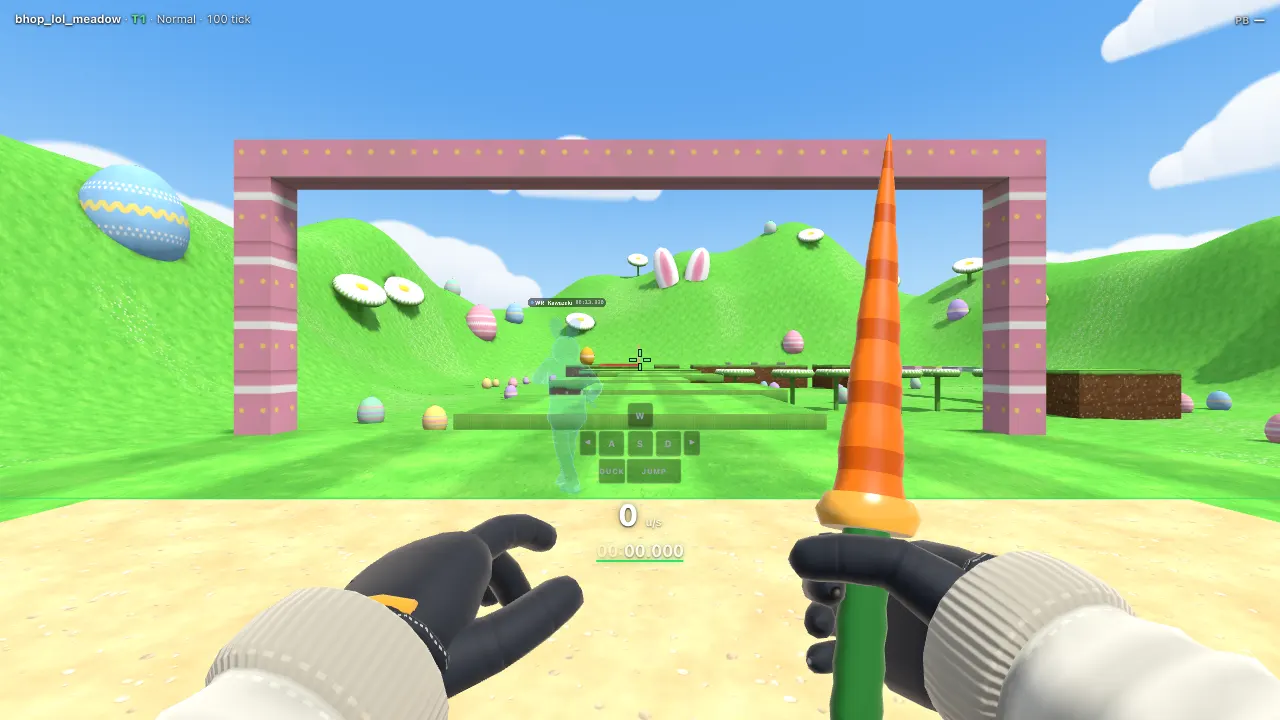
Quick start
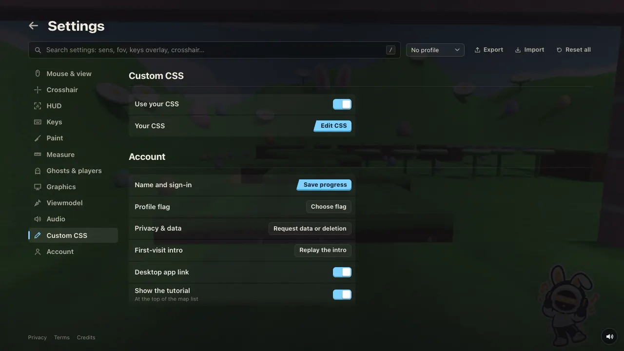
Open Settings → Custom CSS → Edit CSS, paste this, and watch the game change behind the editor.
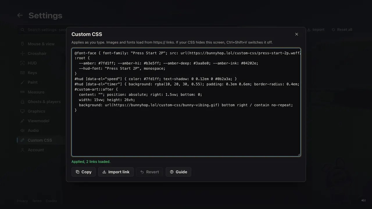
@font-face { font-family: "Press Start 2P"; src: url(https://bunnyhop.lol/custom-css/press-start-2p.woff2); }
:root {
  --amber: #7fd1ff; --amber-hi: #b3e5ff; --amber-deep: #3aa8e0; --amber-ink: #04202e;
  --hud-font: "Press Start 2P", monospace;
}
#hud [data-el="speed"] { color: #7fd1ff; text-shadow: 0 0.12em 0 #0b2a3a; }
#hud [data-el="timer"] { background: rgba(10, 20, 30, 0.55); padding: 0.3em 0.6em; border-radius: 0.4em; }
#custom-art::after {
  content: ""; position: absolute; right: 1.5vw; bottom: 0;
  width: 15vw; height: 26vh;
  background: url(https://bunnyhop.lol/custom-css/bunny-vibing.gif) bottom right / contain no-repeat;
}
Your CSS is kept in this browser, not with your account. Copy in the editor shares it: paste it in Discord and anyone can paste it into theirs.
Change the colours
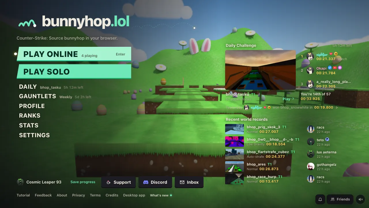
The game's colours are CSS variables on :root. Set them again and everything that uses them follows. The accent (buttons, highlights, switches, the selected row) is the amber family.
:root {
  --amber: #6ee7b7;       /* the accent */
  --amber-hi: #a7f3d0;    /* hover */
  --amber-deep: #10b981;  /* the darker edge under buttons */
  --amber-ink: #062d22;   /* text on the accent */
  --amber-wash: rgba(110, 231, 183, 0.12); /* faint accent backgrounds */
}
Text is the cream family (--cream, --cream-2, --cream-3) and backgrounds are the ink family (--ink-0 darkest to --ink-4). Speed gain and loss are --gain and --loss. All of them are in the reference.
A colour-blind palette from Settings → HUD sets --gain, --loss and a few others on the page itself. Add !important to win over it.
Change the font
Any font installed on your computer works by name. There are three to set:
:root {
  --font-ui: "Trebuchet MS", sans-serif; /* menus, buttons, titles */
  --font-text: Georgia, serif;           /* longer text */
  --hud-font: "Courier New", monospace;  /* the in-game HUD */
}
For a font everyone gets, load it from a link with @font-face. A .woff2 file is best.
@font-face { font-family: "Press Start 2P"; src: url(https://bunnyhop.lol/custom-css/press-start-2p.woff2); }
:root { --hud-font: "Press Start 2P", monospace; }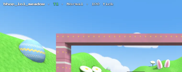
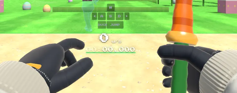
Press Start 2P is by The Press Start 2P Project Authors, under the SIL Open Font License. Google Fonts files work the same way: open the font's CSS link (fonts.googleapis.com/css2?family=…), find the .woff2 link in the latin block, and put that link in src.
Style the HUD
Every HUD element is a box you can select by name: #hud [data-el="speed"], #hud [data-el="timer"] and so on. Press F2 in game for the layout editor: it shows every element with its name.
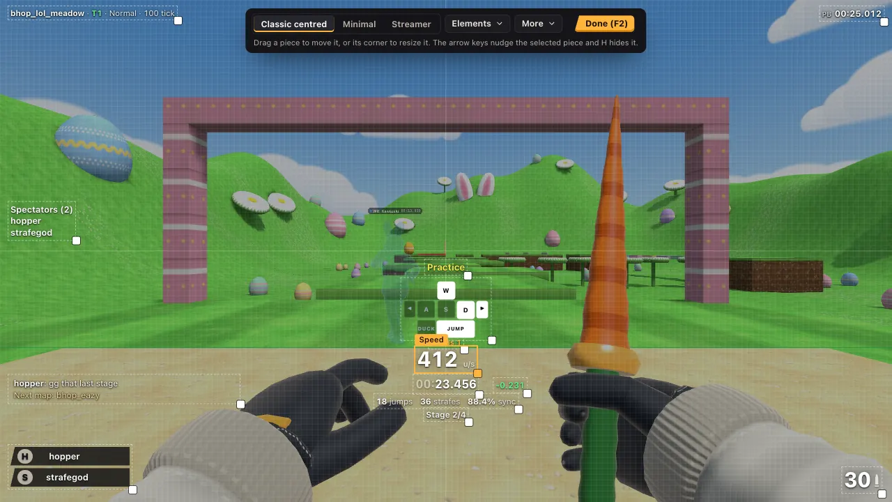
#hud [data-el="speed"] { color: #ffd166; text-shadow: 0 0.12em 0 #7a4a00; }
#hud [data-el="timer"] { background: rgba(12, 12, 15, 0.6); padding: 0.2em 0.6em; border-radius: 0.4em; }
#hud [data-el="keys"] { opacity: 0.5; }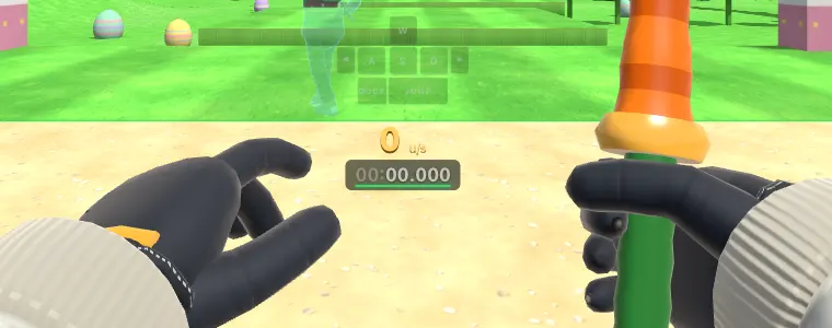
Move, resize, show and hide elements with the layout editor, not with CSS. It places each box and scales it with the HUD scale, so a font-size, left or top in your CSS fights it. Colours, shadows, backgrounds, borders, padding, opacity and fonts are yours.
The replay viewer has its own HUD with the same names inside #rv. To style both: :is(#hud, #rv) [data-el="speed"].
Recent records and races
The list of recent world records on the main menu is #home-records. Each row has two parts: [data-part="run"] (the map, the style and the time) and [data-part="player"] (who set it).
In a race, #mp-count is the 3, 2, 1 and GO in the middle of the screen (.go while it says GO), #mp-place is your place as you finish a room race (.first when you're 1st), and #mp-race is the race line at the top, which turns into the standings when the race is over (.result, and .won when you won). They're part of the HUD: they use the HUD font and colour, GO uses the accent and a win uses --gain.
#home-records h2 { color: var(--amber); }
#home-records [data-part="player"] { opacity: 0.8; }
#mp-count { color: #7fd1ff; }
#mp-count.go { color: var(--gain); }
To hide the records list: :root { --home-records: none; }.
While someone is streaming, #home-live shows above the records: who is live, with the same rows. [data-part="stream"] is the stream (the platform, the title and how long) and [data-part="player"] is who. :root { --home-live: none; } hides it. Next to a name in a room, .nm-live is the LIVE mark.
On a leaderboard row (and a profile's records), [data-part="row-menu"] is the ⋯ button next to Watch and Race. It opens the row's other actions: Copy start, Copy link and Report. It uses --faint until the row is hovered or focused, then --text.
[data-part="row-menu"] { color: var(--accent); }The Daily Challenge
One map a day, the same for everyone. It shows in three places.
On the main menu it is #home-daily, above the recent records. Its parts: [data-part="left"] (the time left), [data-part="map"] (today's map, the button that plays it), [data-part="top"] (the three fastest today), [data-part="you"] (your place) and [data-part="yesterday"] (yesterday's winner). In a row of the three fastest, [data-part="player"] is the name and [data-part="watch"] the time, which plays that run's replay. On a day played in another style than Normal the heading carries [data-part="style"] (the style's name) and the map button has data-style. A guest who has played sees [data-part="save"], the Save progress link. :root { --home-daily: none; } hides the block, and six maps to try take its place.
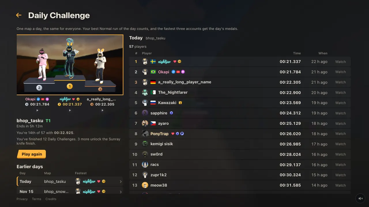
The Daily Challenge screen is body[data-screen="daily"]. Its podium is .dyp: .dyp-frame is the picture with the day's three fastest players standing on it, and .dyp-caps holds the three names under it, each a .dyp-cap with data-place 1, 2 or 3 (.empty while nobody has that place). The round button under a name is [data-part="watch"], which plays that run.
In a daily run, .hud-daily is the line under the map name in the HUD, and .ec-daily is the line with your place for the day on the card at the end of the run (#hud-endcard).
#home-daily h2 { color: var(--amber); }
#home-daily [data-part="left"] { color: var(--cream); }
.dyp-frame { border-radius: 0; outline: 2px solid var(--amber); }
.dyp-cap[data-place="1"] { font-weight: 800; }
The map vote
In a server, the vote for the next map is #mp-menu[data-menu="vote"], on the left of the screen while you keep playing. .mm-title is its heading. Each option is a .mm-item with its number in .mm-key and its tier and votes in .mm-detail; .sel is the one you voted for, tinted with the accent. .mm-hint is the "Press a number to vote" line and .mm-footer the time left.
#mp-menu[data-menu="vote"] { background: rgba(12, 12, 15, 0.9); border-radius: 0; }
#mp-menu[data-menu="vote"] .mm-item.sel { background: var(--amber); color: var(--amber-ink); }
#mp-menu[data-menu="vote"] .mm-item.sel :is(.mm-key, .mm-detail) { color: var(--amber-ink); }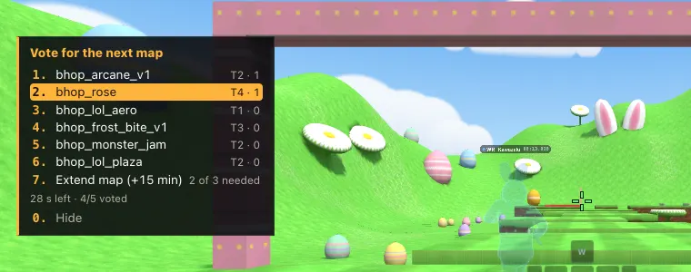
The game's other numbered menus (checkpoints, spectating, race invites) are the same box with another data-menu; #mp-menu alone styles them all.
The Loadout
The Loadout is on your profile, in the pause menu and on the Support page. It has three columns: the slots in a list on the left, the stage in the middle and the items on the right.
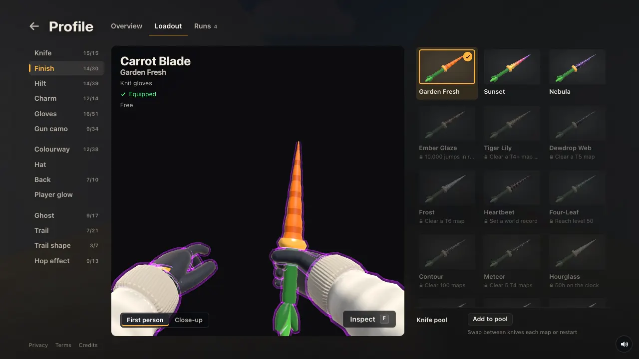
.lo-tabis an entry in the slot list.data-slotnames it:knife,finish,hilt,charm,glove,camo,outfit,hat,back,glow,ghost,trail,shapeorhop..onis the open one..lo-stageis the stage with the 3D preview.data-viewis what it shows:fp(first person),close(the item close up),bunny,ghost,hop,gunorgunside..lo-gridis the list of items. Each item is a.lo-tilewithdata-id(the item's id);.onis the one you wear and.lockedone you don't have yet..lo-optsis the block under the items with the open slot's options: the knife pool, the player model, hair colours and so on.
.lo-tab.on { color: var(--amber); }
.lo-stage[data-view] { background: var(--ink-0); }
.lo-tile.on { background: var(--amber-wash); }
.lo-tile.locked { opacity: 0.6; }
The stage has a different backdrop for each view, so .lo-stage[data-view] is the selector that replaces them all. The preview itself is drawn by the game on a canvas; CSS reaches what is around it.
Player cards
A player who holds a map's world record can put that map behind their card. The picture is .pc-mapbg, on the profile card and on the mini profile that opens over a name. Its ::after is the shade over the picture, and --map-dim is how much that map is darkened (0 to 0.6, more for bright maps). The card carries .pc-has-mapbg while it shows one. .pc-wrline (profile card) and .hc-wrline (mini profile) are the line that names the map and the time.
.pc-mapbg::after { background: rgba(0, 0, 0, 0.6); }
.pc-wrline, .hc-wrline { color: var(--wr); }
The flag before the name is .pc [data-part="flag"].
In Edit card on your profile, .ce-part is a part in the list on the left (data-part is background, frame, effects, avatar, flag, name, title, badges or links; .on is the open one) and .ce-item is a choice in the list beside the card: .on is on your card, .locked is one you don't have yet and .trying is a locked one you are previewing.
A card's frame, border and effects are the player's own choice, drawn in layers inside the card whose class names can change. Leave them alone unless you mean to change every player's card.
On a leaderboard, the run stats card that opens at the pointer over a row is #run-stats-card.
Put an image in a corner
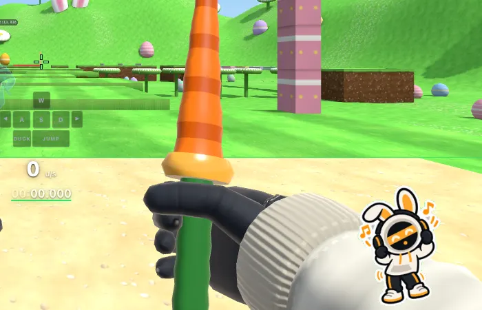
#custom-art is an empty layer over the whole screen, above the game and below the menus, there for this. Its ::before and ::after are free, and GIFs animate.
#custom-art::after {
  content: ""; position: absolute; right: 1.5vw; bottom: 0;
  width: 15vw; height: 26vh;
  background: url(https://bunnyhop.lol/custom-css/bunny-vibing.gif) bottom right / contain no-repeat;
}
- Use the image's own link, the one ending in .gif, .png or .webp. On imgur, right-click the image and copy the image address (it starts with
https://i.imgur.com/). - PNG, GIF, WebP, AVIF, JPEG and SVG, up to 8 MB each.
- It hides with Hide UI, like the rest of the HUD.
- To keep it over the menus too:
#custom-art { z-index: 30; }. Clicks always go through it. - Only while you play:
body:not(.in-game) #custom-art { display: none; }
Use live numbers
While your CSS mentions them, the game writes these on #hud and #custom-art as whole numbers, each time they change.
| Variable | What it is |
|---|---|
--hud-speed | Speed in units per second |
--hud-sync | Sync of the current run, 0 to 100 |
--hud-jumps | Jumps in the current run |
--hud-strafes | Strafes in the current run |
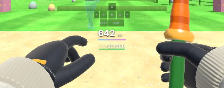
A bar under the speed that fills up to 1000 u/s:
#hud [data-el="speed"]::after {
  content: ""; display: block; height: 0.3em; margin-top: 0.35em; border-radius: 1em;
  width: calc(min(var(--hud-speed, 0), 1000) * 0.01em);
  background: linear-gradient(90deg, #7fd1ff, #ff7ad9);
}
Print one as text with a CSS counter:
#custom-art::before {
  counter-reset: sync var(--hud-sync, 0);
  content: "sync " counter(sync) "%";
  position: absolute; left: 1vw; bottom: 1vh; color: #fff; font: 700 1.2rem var(--hud-font);
}
Big themes: restyle everything
The whole game UI is plain HTML and CSS, so a theme can go as far as you like: rebuild the main menu, move things, swap images and icons. Slant, a demo theme, turns the main menu into a slanted paper sidebar, puts the HUD in slanted boxes and sits a bunny beside the speed.
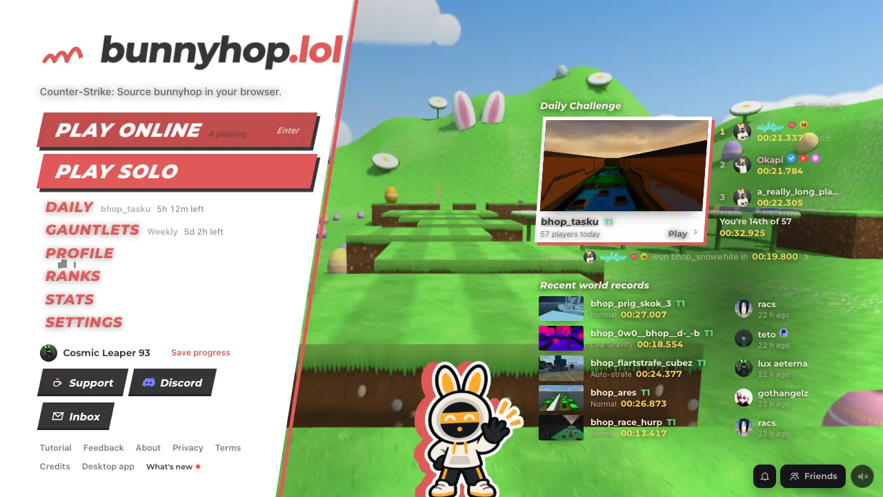
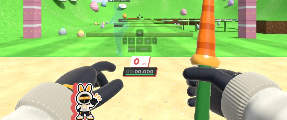
Big themes come in two files. The theme itself is a .css file at a link that gives the raw file (GitHub Pages, a gist's Raw link); Slant's is /custom-css/themes/slant.css. Players paste a short file: an @import of the theme, then its options as variables.
/* Slant for bunnyhop.lol. The line below keeps it up to date. */
@import url(https://bunnyhop.lol/custom-css/themes/slant.css);

:root {
  --slant-accent: #e15959;  /* the theme's colour */
  --slant-paper: #fff;      /* panels: #fff light, #1e1e22 dark */
  --slant-ink: #353535;     /* text on panels */
  --slant-mascot: 1;        /* 1 shows the bunny, 0 hides it */
}
The game fetches imported files each time it starts (a copy can be up to 10 minutes old), so when the author updates the theme, everyone using it gets the update. Last visit's copy is used while it loads, and if the link is down.
Tricks big themes use
- Options as variables. The theme reads
var(--slant-accent); players set it. Switch a part on and off withopacity: var(--slant-mascot). - One screen at a time:
body[data-screen="home"]is the main menu; the other screens are in the reference. One menu entry:[data-item="play"]. Every entry of the main menu and the pause menu has adata-item. - Recolour a picture to the theme's colour by using it as a mask over that colour:
background: var(--slant-accent); mask: url(https://example.com/logo.png) center / contain no-repeat; - Replace a picture:
content: url(https://example.com/new.png);on theimg. - Icon sets:
https://api.iconify.design/mdi/cog.svg?color=whiteis one icon as an image link. !importantwins over the game's own inline styles. For HUD elements, move them with the layout editor (F2) instead.- Styling class names that aren't in the reference works, but an update can change them. Slant marks the lines that do.
Example themes
Three themes to paste as they are or to change. Each is a short file that imports the theme and sets its options.
Slant with the Yuki Aim girl
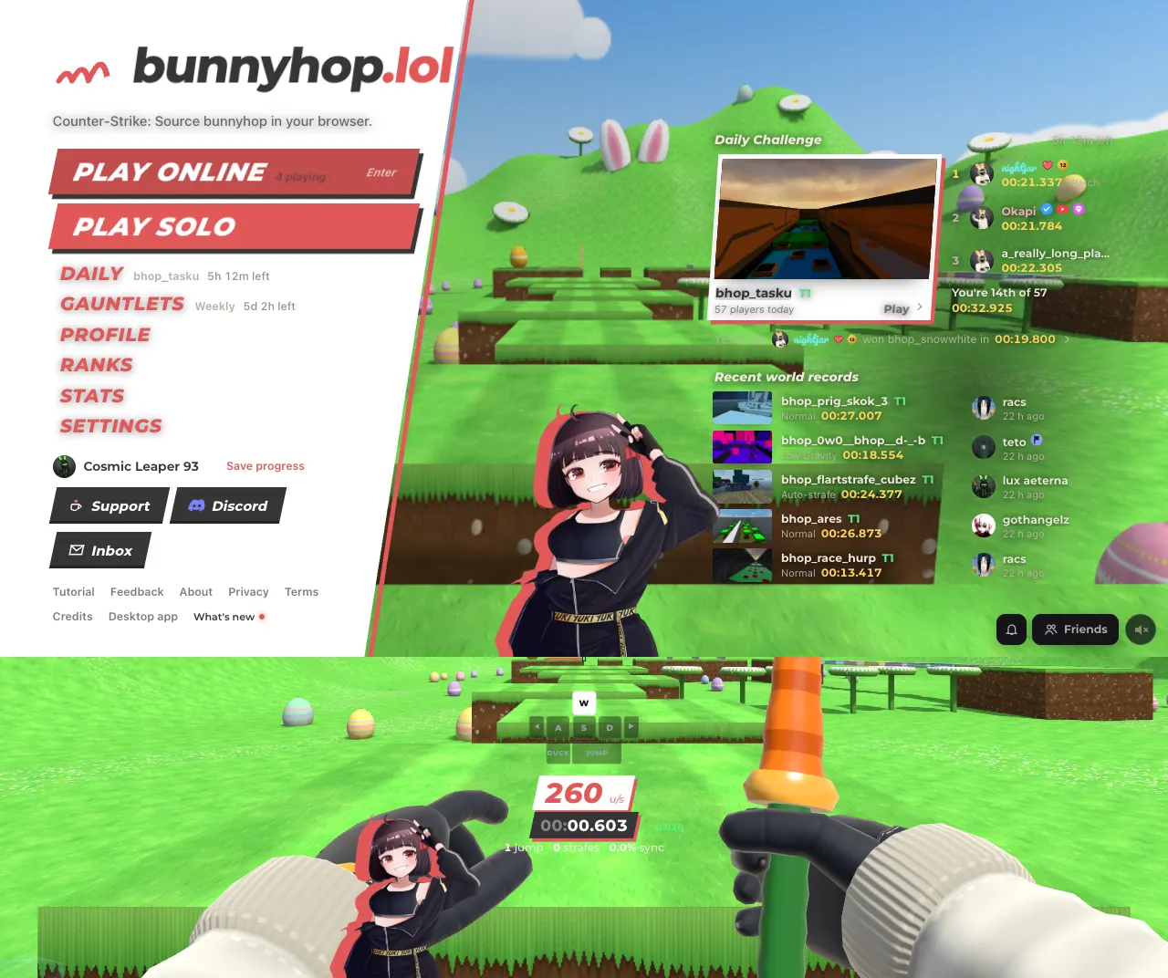
Slant with the girl from the Yuki Aim theme in place of the bunny; --slant-art takes any picture link, so any mascot works.
/* Slant with the Yuki Aim girl, for bunnyhop.lol. */
@import url(https://bunnyhop.lol/custom-css/themes/slant.css);

:root {
  --slant-accent: #e15959;  /* the theme's colour */
  --slant-paper: #fff;      /* panels: #fff light, #1e1e22 dark */
  --slant-ink: #353535;     /* text on panels */
  --slant-mascot: 1.4;      /* 0 hides her, above 1 makes her bigger */
  --slant-art: url(https://bunnyhop.lol/custom-css/themes/slant-yuki.png);
}
Source
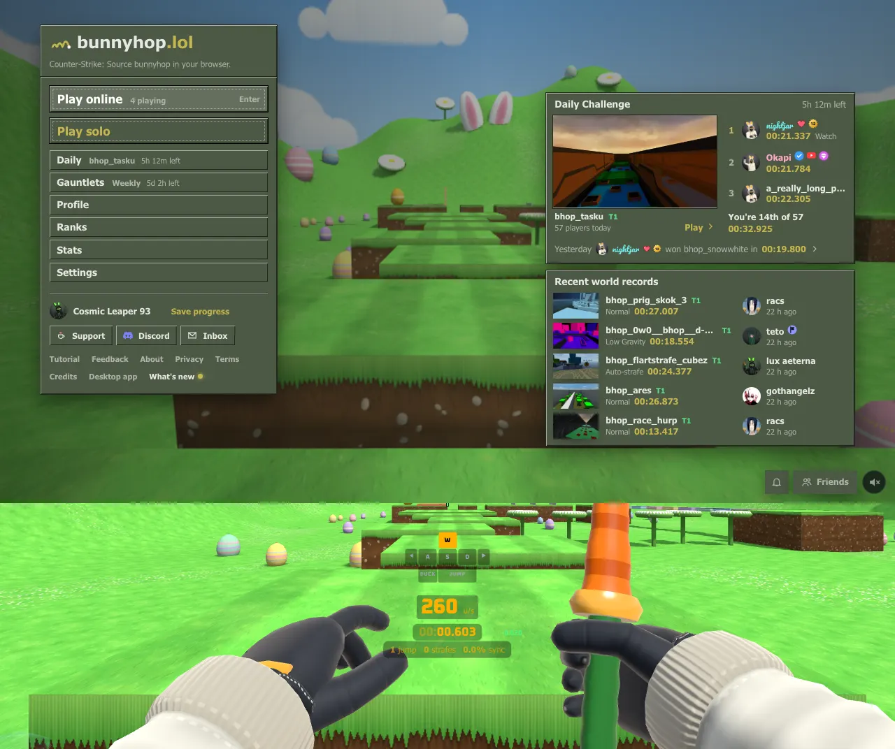
Olive panels and bevelled buttons like the old Source engine menus, with amber numbers on dark boxes like the Counter-Strike: Source HUD.
/* Source for bunnyhop.lol. The line below keeps it up to date. */
@import url(https://bunnyhop.lol/custom-css/themes/source.css);

:root {
  --source-panel: #4c5844;                /* menu panels: #4c5844 olive, #4a4a46 grey */
  --source-highlight: #c4b550;            /* the selected entry */
  --source-hud: #ffb000;                  /* HUD numbers */
  --source-hud-box: rgba(0, 0, 0, 0.35);  /* boxes behind them, transparent hides them */
}
Clean
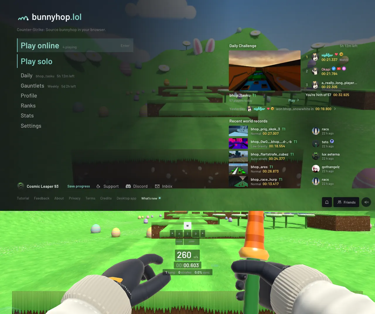
Plain menus with one accent colour and a quiet HUD with even-width numbers, for playing seriously or streaming.
/* Clean for bunnyhop.lol. The line below keeps it up to date. */
@import url(https://bunnyhop.lol/custom-css/themes/clean.css);

:root {
  --clean-accent: #7fd1c4;                 /* the one colour */
  --clean-text: #eef0f2;                   /* text and HUD numbers */
  --clean-panel: #121417;                  /* menu panels */
  --clean-hud-box: rgba(12, 13, 15, 0.5);  /* plates behind the HUD, transparent hides them */
}
More themes
Seven more themes are hosted the same way. Each has a thread in the custom-css forum on the game's Discord with a preview and the short file to paste. That file also links a picture for the corner from another site, which is why it isn't printed here. To use one without it, import the file and set its options, which are listed at the top of each file. They are also the biggest themes to read if you are writing your own.
| Theme | File | The look |
|---|---|---|
| Random Play | proxy.css | Black and signal orange in the style of Zenless Zone Zero: halftone and hazard tape, the maps as tapes on a video-store shelf |
| Heart of the Cards | duel.css | A Yu-Gi-Oh duel: the maps are cards with a level star for each tier, and your speed is your Life Points |
| Gotta Hop 'Em All | dex.css | A Pokédex: the main menu is the device opened up, the maps are numbered entries, the HUD is on a green handheld screen |
| Hop Prism Power | magical.css | A magical girl transformation: twilight menus with satin ribbons and lace, your speed as ten hearts |
| Take Your Heart | persona.css | Red, black and white in the style of Persona 5: slanted slabs, ransom-note titles, every finish a calling card |
| Close the World | lain.css | Serial Experiments Lain: every menu a grey Navi window, the HUD a terminal readout |
| Down the Bunny Hole | subahibi.css | Subarashiki Hibi: a summer sky over the school roof, menus as paper choices, the timer on a pocket watch |
If something breaks
The line under the editor says which links didn't load and why.
If your CSS hides the way back to Settings, press Ctrl+Shift+V anywhere in the game. It switches your CSS off (press it again to switch it back on), in the browser and the desktop app alike.
On the site you can also open bunnyhop.lol/?nocss: the game loads without your CSS for that visit.
Desktop app
In the desktop app, press F10 → Custom CSS → Choose…, or New… for a starter file. Edit the file in any editor: the game reloads it each time you save. While a file is chosen the game uses it instead of the CSS pasted in Settings; Stop using goes back.
What loads and what doesn't
Pasted CSS can come from anyone, so links in it are handled with care.
https://links (images, fonts and imported .css files) are fetched once, when the CSS is applied, through bunnyhop.lol. The site hosting them never sees your IP address, and nothing is requested later because of what's on screen.- Images and fonts come back only if they really are one: PNG, GIF, WebP, AVIF, JPEG, BMP, ICO, SVG, WOFF, WOFF2, TTF and OTF. Images up to 8 MB, fonts up to 24 MB, at most 256 links.
@import url(https://…)brings in a .css file: up to 4 levels deep, 24 files and 2 MB of CSS together. Links inside an imported file can be relative to it.data:URLs work (no request at all).- Relative links in the CSS you paste (
url(image.png)) and other kinds of links don't load. - CSS only. Scripts can't run, and CSS can't read or send anything from the page.
- At most 256 KB of pasted CSS.
What stays the same between updates
These keep working from one update to the next:
- the variables in the reference,
#hud,#rv,#crosshairand#custom-art,[data-el="…"]with the HUD element names,#voice-hudwith its row classes in the reference,#hud-endcardand#nt-cels,#home-recordswith its[data-part]rows and--home-records,#home-livewith its[data-part]rows and--home-live,#home-dailywith its[data-part]pieces and--home-daily, and.nm-live,- the Daily Challenge screen's podium
.dypwith.dyp-frame,.dyp-capsand.dyp-cap, and in a daily run.hud-dailyand.ec-daily, #mp-count,#mp-placeand#mp-racewith the classes in the reference, and the map vote#mp-menu[data-menu="vote"]with its classes in the reference,- the Loadout's
.lo-tab,.lo-stage,.lo-grid,.lo-tileand.lo-optswith the attributes and classes in the reference, - on player cards
.pc-mapbg(a world record map as a card's background),.pc-wrline/.hc-wrlineand.pc [data-part="flag"], and Edit card's.ce-partand.ce-item, - a leaderboard row's
[data-part="row-menu"], the run stats card#run-stats-card, and a server's[data-part="server"]row on Play online with its parts in the reference, body[data-screen]with the screen names and[data-item]on menu entries,- the body classes,
- the live numbers.
Anything else (other class names, how the menus are built) can change in any update. If you style it, expect to fix it now and then.
Reference
Colours
| Variable | Default | Used for |
|---|---|---|
--amber | #ffb43c | The accent: buttons, highlights, switches |
--amber-hi | #ffc867 | The accent on hover |
--amber-deep | #e08a12 | The darker edge under buttons |
--amber-ink | #1d1306 | Text on the accent |
--amber-wash | rgba(255, 180, 60, 0.12) | Faint accent backgrounds |
--cream | #efe9dd | Main text |
--cream-2 | #b8b1a4 | Secondary text |
--cream-3 | #8b8579 | Faint text |
--ink-0 | #0c0c0f | Page background |
--ink-1 | #141418 | Panels |
--ink-2 | #1c1c22 | Raised panels, fields |
--ink-3 | #26262d | Borders, hovered rows |
--ink-4 | #33333c | Strong borders |
--scrim | rgba(12, 12, 15, 0.78) | Behind dialogs |
--carrot | #ff7a1a | Carrot orange highlights |
--wr | #ffd45e | World record gold |
--gain | #4dff88 | Speed gain, ahead of your PB |
--loss | #ff5d5d | Speed loss, behind your PB |
--sync-ok | #ffd24d | Middling sync |
--zone-start | #33dd66 | Start zone line under the timer |
--practice | #f2e64a | The practice timer |
--ghost | #66b3ff | Ghosts |
--tier-1 to --tier-10, --tier-x | Map tier colours |
Fonts
| Variable | Used for |
|---|---|
--font-ui | Menus, buttons, titles |
--font-text | Longer text |
--hud-font | The in-game HUD |
--mono | Code and keys |
Shape and motion
| Variable | Used for |
|---|---|
--r-1, --r-2, --r-3 | Corner radii: tags, controls, panels |
--fs-2xs to --fs-2xl | Text sizes |
--t-tick, --t-step, --t-hop, --t-air | Animation lengths |
--ease-glide, --ease-land | Animation curves |
HUD elements
Select them with #hud [data-el="name"].
| Name | Element |
|---|---|
speed | Speed |
timer | Timer |
split | Split vs PB |
track | Bonus / track |
stage | Stage / CP |
stats | Jumps · strafes · sync |
sync | Sync bar |
keys | Keys overlay |
ghostKeys | Ghost keys |
graph | Speed graph |
jumpStats | Jump stats |
map | Map / style line |
pb | Personal best |
fps | FPS counter |
chat | Chat |
ammo | Ammo |
strafeTrainer | Strafe trainer |
startPre | Start Pre |
strafeOffsets | Strafe offsets |
firstJump | First jump tick |
longJump | Longjump stats |
spectators | Spectator list |
practice | Practice |
jhud | JHUD |
ghostSpeed | Speed vs ghost |
voice | Voice list |
Screens and menu entries
body[data-screen] names the screen that's open: home (the main menu), maps, settings, controls, pause (Esc in game), profile, ranks, servers, stats, gauntlets, gauntlet, daily, support, loading.
Each entry of the main menu and the pause menu has data-item: its label in lower case with dashes. The main menu opens with two big buttons, play-online and then play (Play solo); style them together with :is([data-item="play"], [data-item="play-online"]).
| Menu | data-item |
|---|---|
| Main menu | play-online, play, learn-to-bhop, daily, gauntlets, continue, profile, ranks, stats, settings, and in the desktop app exit-game |
| Pause menu | play or resume, restart, main-track, practice or leave-practice, play-online, change-map, learn-to-bhop, loadout, settings, profile-ranks, feedback, inbox, main-menu, and in the desktop app exit-game |
Other hooks
| Selector | What it is |
|---|---|
#hud | The in-game HUD |
#rv | The replay viewer |
#crosshair | The crosshair (its shape and colour are in Settings → Crosshair) |
.st-trainer[data-style="bar"] | The strafe trainer's Bar look. .st-rail is the track, .st-fill the fill, .st-target the centre tick. data-edge is left or right, data-band is perfect, good, ok, low or high |
.st-trainer[data-style="gauge"] | The strafe trainer's Gauge look, a filled half dial. .st-face-fill is the blue to white to red face (a CSS gradient by angle), .st-disc the SVG over it: .st-disc-mark the green line at 100%, .st-pointer the needle and .st-pivot its hub. The needle turns by an SVG transform on .st-disc .st-needle, so a CSS transform there stops it. data-zone is good, ok or bad |
.st-trainer[data-style="arc"] | The strafe trainer's Arc look, the same dial as a thin line. .st-dial is its SVG: .st-dial-bad, .st-dial-ok and .st-dial-good are the zone arcs (set their stroke), .st-dial-mark the centre mark, .st-needle the needle and .st-hub its pivot. The needle turns by an SVG transform, so a CSS transform on .st-needle stops it |
#custom-art | An empty layer for your images, with free ::before and ::after |
#voice-hud | The voice list: who is talking in a server. It sits in the HUD element voice, so the layout editor moves, sizes and hides it. Each talker is a .vh-row (.self is yours, .vh-card a supporter's row with their card behind it, data-slot their player number); .vh-graph is the spectrum and .vh-line the line under the list |
#hud-endcard | The card at the end of a run: your time, your place and what the run earned |
#nt-cels | The plates at the bottom of the screen for things you earned: unlocks, level-ups, rewards |
#home-records | The recent world records on the main menu. Rows: [data-part="run"] (map, style, time) and [data-part="player"] (who set it). :root { --home-records: none; } hides it |
#home-live | Who is streaming right now, above the records (only while someone is). Rows: [data-part="stream"] (platform, title, how long) and [data-part="player"] (who). :root { --home-live: none; } hides it |
#home-daily | The Daily Challenge on the main menu. Parts: [data-part="left"] (time left), [data-part="map"] (today's map, with data-style), [data-part="top"] (the three fastest; in a row [data-part="player"] is the name and [data-part="watch"] the time), [data-part="you"] (your place), [data-part="yesterday"] (yesterday's winner), [data-part="style"] (the style's name on a day that isn't Normal), [data-part="save"] (a guest's Save progress link). :root { --home-daily: none; } hides it |
.dyp | The podium on the Daily Challenge screen. .dyp-frame is the picture with the three fastest players on it, .dyp-caps the names under it; each name is a .dyp-cap with data-place 1, 2 or 3 (.empty while nobody has that place) and a [data-part="watch"] button |
.hud-daily, .ec-daily | In a daily run: the line under the map name in the HUD, and the line with your place for the day on #hud-endcard |
.nm-live | The LIVE mark next to a streaming player's name in rooms, the scoreboard and hover cards |
#mp-menu[data-menu="vote"] | The map vote on the left of the screen while a server votes. .mm-title is the heading. Each option is a .mm-item (.sel is your vote) with its number in .mm-key and its tier and votes in .mm-detail; .mm-hint is the "Press a number to vote" line and .mm-footer the time left |
#mp-count | The race countdown: 3, 2, 1, then GO (.go) |
#mp-place | Your place as you finish a room race (.first for 1st) |
#mp-race | The race line at the top, and the standings when the race is over (.result, .won when you won) |
[data-part="row-menu"] | A leaderboard row's ⋯ button: Copy start, Copy link, Report |
#run-stats-card | The run stats card that opens at the pointer over a leaderboard row |
[data-part="server"] | A server on Play online. In it, [data-part="map"] is the picture of its map, [data-part="players"] is who is playing there and [data-part="player"] is each of them |
.lo-tab | An entry in the Loadout's slot list. data-slot is knife, finish, hilt, charm, glove, camo, outfit, hat, back, glow, ghost, trail, shape or hop; .on is the open one |
.lo-stage | The Loadout's stage with the 3D preview. data-view is fp, close, bunny, ghost, hop, gun or gunside; each view has its own backdrop, so .lo-stage[data-view] replaces them all |
.lo-grid, .lo-tile | The Loadout's items. Each .lo-tile has data-id (the item); .on is the one you wear and .locked one you don't have yet |
.lo-opts | The block under the Loadout's items with the open slot's options (knife pool, player model, hair colours) |
.pc-mapbg | The map picture on a player card whose owner holds that map's world record (profile card and mini profile). Its ::after is the shade over the picture; --map-dim is the map's own darkening (0 to 0.6). The card carries .pc-has-mapbg while it shows one |
.pc-wrline, .hc-wrline | The "WR map time" line on those cards (profile card, mini profile) |
.pc [data-part="flag"] | The flag before the name on a player card. In Edit card, .pc-flag-empty is the empty outline in its place while you have no flag |
.ce-part, .ce-item | Edit card on your profile. .ce-part is a part in its list: data-part is background, frame, effects, avatar, flag, name, title, badges or links, and .on is the open one. .ce-item is a choice in the list beside the card: .on is on your card, .locked is one you don't have yet and .trying is a locked one you are previewing |
body.in-game | A map is loaded |
body.menu-open | A menu is open over the game |
body.ui-hidden | Hide UI is on |
body.potato | Potato graphics mode |
body.mp-spectating | Spectating someone in a server |
body.mp-spec-inputs | Spectating someone whose keys and jump stats come through |
For AI agents
An agent can write a theme for you. Give it this, with your own words where it says what you want:
Write custom CSS for bunnyhop.lol. Read https://bunnyhop.lol/custom-css.md first and follow its rules and reference.
What I want: <describe the look: colours, font, HUD style, an image link for the corner>.
Give me one CSS block to paste in Settings → Custom CSS.
The rules an agent should follow, also at the end of /custom-css.md:
- One plain CSS block. No JavaScript, no relative links.
@importonly for a theme file the player hosts or names. - Only the variables, selectors and live numbers in the reference; other class names can change without notice.
- Colours through the variables on
:root(the amber family for the accent) rather than element by element. - No
font-size,left,top,widthortransformon#hud [data-el]boxes; the layout editor (F2) moves and sizes them. - Images and fonts as
https://links straight to the file, ordata:URLs. At most 256 links. - Screens through
body[data-screen]and menu entries through[data-item], not class names. - Decorative images on
#custom-art::before/::afterwithposition: absolute.